


Halloween is right around the corner, and while we enjoy the chills and thrills of haunted houses and spine-tingling horror films (sometimes behind a cushion with one eye closed), there's one place we never want to encounter a scare: within our in-app experiences. Ready to go on a hair-raising journey? Let's uncover the dark side of in-app experiences and exorcise these ghostly glitches—forever!
Psst. This is a recap of our webinar "Prevent Spooky In-App Experiences From Haunting Your Product". Catch the full on-demand replay with extra in-app UX ghost-busting tips here.
What makes a "spooky" in-app experience? #
Every user enters a new app or product with expectations of what they want to do. And everyone has different needs or motivations. But, nothing sends users running to the hills faster than finding an in-app “poltergeist”.
These experiences aren't just minor annoyances. A "spooky" in-app experience can disrupt your user's journey immensely; leading to frustration, churn, and a lingering sense of unease about your product.
But fear not! With the right knowledge and tools, you can banish these pesky characters for good. Shall we meet them and banish them together?
The three types of in-app UX monsters #
Meet the zombies 🧟 #
Spotting a zombie in the wild is easy because they live forever. You just can't get rid of them. Users might try to close them or dismiss them, but the haunting continues.
Imagine the angst when an upsell modal keeps popping up long after a user hits "exit". The frustration is real. Recognizable by their persistence, they usually emerge due to poor recurrence settings.
The antidotes? Features like Snoozing, which lets users decide when they'll revisit a tour, or Smart Delays, which wait until a pause in user activity, or a specific keyboard input—ensure that your users are engaged at the right time. Add some Rate Limiting into your arsenal of antidotes to prevent users from being overwhelmed by a horde of in-app messages.
Enter the house of ghosts 👻 #
Eerie and elusive, these experiences have minds of their own—appearing and disappearing unpredictably. Were they real? Or did you imagine seeing one…
Often, they're not anchored correctly within the app, making them seem disconnected from the user's current action or context. Features like Element Triggering ensure that Tours only appear when relevant elements are present. Alerts can be a handy way to identify if your experiences have gone spectral, floating away from their intended purpose.
Run from the grievous goblins 👹 #
The tricksters of the bunch, goblins, cause chaos by not showing up when they should or wreaking havoc with your app's layout. Their mischief often emerges in the intricate corners of your tech, like iFrames or Shadow DOMs.
To goblin-proof your app, you need a product adoption platform that is compatible with Single-Page Apps (SPAs), Shadow DOMs, and iFrames. Features that will help here are those that wait for specific conditions or triggers to keep these monsters at bay.
Turning scary in-app UX into delightful experiences 👻 #
With our digital ghouls identified and antidotes in hand, it's time to embark on a journey to transform the haunted digital paths into delightful experiences.
Choice is your magic wand #
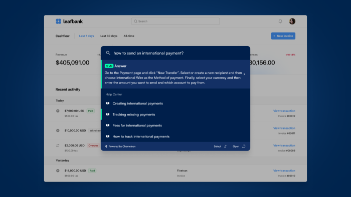
Just as every Halloween reveler chooses their disguise, users should have choices in their app experience. With Chameleon's flexible and native-looking product tours, users can follow paths that resonate with their needs, rather than being railroaded down a one-size-fits-all journey. Or try using Command+K in-app search to surface your help content contextually in your app, sign up for a free Chameleon account to give it a whirl!
Less is more (even for witches' brew) #
Avoid overwhelming users with too much guidance. Instead of an overwhelming option of tours and tooltips, opt for subtle nudges, directing users to essential features at the right moment.
Control is key, even in a coven #
As teams grow and more people get involved in shaping the in-app experience, it's crucial to maintain control. Using features that allow you to review changes ensures that you're not waking up to a surprise horror show. With User Permissions and Rate Limiting, you can ensure that your app doesn’t become a chaotic cauldron of notifications.
Catch up with the full webinar on demand
As Halloween approaches, and we revel in the spooky season's delights, let's also commit to exorcising the ghostly glitches from our apps. With Chameleon by your side, armed with its array of powerful features, you can transform your in-app experience from hauntingly bad to wickedly wonderful.
Book a demo to find out more (we promise, it's human-led, not goblin-led!). Or catch the full webinar below 👇

