


Learning software in the early days meant reading dense documentation or having someone stand over your shoulder giving instructions. Neither option was ideal.
Forcing users through a lot of friction, without supporting them with interactive product explanations, risks them failing; over two-thirds of apps are used once and never again!
One of the most effective ways we've found to improve retention and adoption are product walkthroughs.
What are product walkthroughs? #
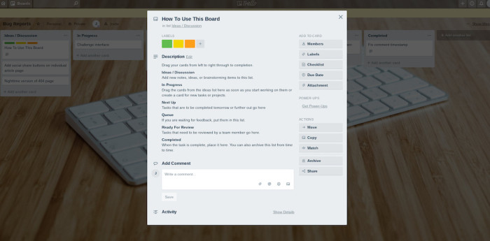
Product walkthroughs are interactive and dynamic product experiences that help users understand the value, taxonomy, and functionality of a product. This could be a modal, followed by some hotspots, or simply a series of tooltips highlighting parts of the UI.
It’s difficult to avoid seeing product walkthroughs when you sign up for a new SaaS tool, website, or social network. A product walkthrough is there to help new users discover core value with an ”Aha!” moment and keep them motivated to continue down their path of using the product. This could mean that new users can easily understand how to complete the setup, or it could showcase new functionality to drive feature adoption among existing users.
Walkthroughs don’t have to be a one-time-only deal that shows up at the start of the user experience; they can be used again and again to cement key info or workflows within your users. Good walkthroughs do this by explaining the bare necessities.
For a video conferencing tool like GoToMeeting, for example, that would be how to mute your mic, leave a meeting, and invite attendees.
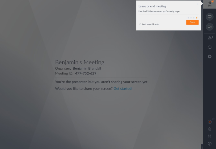
It's important to keep product walkthroughs short, as GoToMeeting does with its sequence of four tooltips
For Slack, on the other hand, it’s an explainer on taxonomy and the difference between public and private channels.
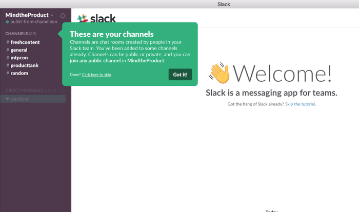
Great product walkthroughs stand out: Slack uses bright and bold colors to help users engage them.
Now that we’ve briefly defined what product walkthroughs are, let’s look at why they’re important.
Why you need to build walkthroughs into your product #
As hinted above, product walkthroughs have different benefits for different users. Don't be apologetic about them. Make them valuable to users and be confident about showcasing them!
Broadly speaking, the goal of product walkthroughs is to:
Retain new users and reduce friction by explaining concepts, taxonomy, and the UI
Improve feature adoption across existing users by highlighting functionality they may have missed or misunderstood
Ultimately, by keeping new users and nurturing existing ones, you get the same outcome. Better retention.
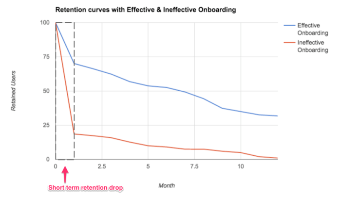
Improving retention in the early phase of a user's engagement with a product can lead to compounding benefits
Whichever kind of walkthrough you’re building, there’s no denying that a user retention strategy is business-critical. That’s because most software loses new users quickly, partially because of poor onboarding.
Here’s a hypothetical example:
Let’s say that you get 1000 sign-ups each month.
A drop-off of 80% after one session is pretty typical.
This leaves 200 users that log in more than once.
By the end of the month, just 4% of users from the cohort are left, so 40 people didn’t churn out.
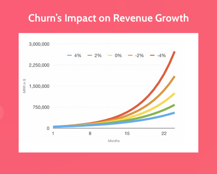
It sounds grim, but to make a big impact on this number, you only need to make a small change in the retention rate. By retaining an extra 1% of users, you up revenue by 20%.
That explains why retention is consistently proven to be a big driver of revenue.
(Source)
Plus, it costs 6-7x less to retain an existing customer than it does to acquire a new one.
When created with defined user segments and a focus on each segment’s goals, product walkthroughs have been seen substantial decreases in churn; a holy grail in software success.
We ran an A/B test and saw churn decreased by 10% for users that were shown Chameleon tours.
However, achieving these results requires a great design of walkthroughs and ongoing iteration. Here are some of the key lessons on how to succeed.
How to plan and build your product walkthroughs #
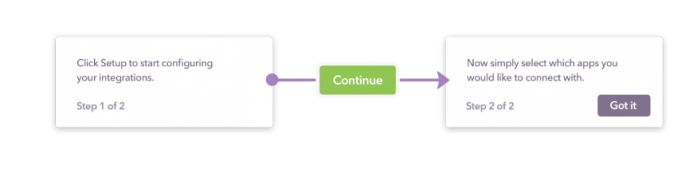
A schematic example of a product walkthrough you can build; can include users taking key actions inside your product.
A good walkthrough is single-purpose, contextual, and relevant to the user seeing it.
That’s why it’s so helpful to think of in-product guidance the same way you would think of a marketing campaign.
When a marketer builds a new landing page, they make sure the page has a clear audience, context, and purpose – there aren’t 10 different CTAs and money being spent blasting the page out to bad-fit leads.
Traditional online marketing has become a codified field of study with obvious best practices that most marketers follow. Product marketing, however, is newer and less clear-cut.
When a product marketer builds a walkthrough to help engage, retain and convert users, the exact same principles apply.
To build a new product walkthrough, you need to think about three things:
The GOAL: using Magic Numbers and “Aha!” moments to set the goal for the walkthrough
The CONTENT: creating the text, images, and interactive elements of the walkthrough
The TARGETING: defining which segment of users will see the walkthrough
Let’s break those down.
1. The GOAL #
Before you begin, you should have a clear sense of the purpose. In many cases, it's the Magic Number – a key indicator that strongly correlates with successful/retained users. Getting more users to this is your ultimate goal in driving product success.
Slack found that they lost 90% of people who signed up through their marketing site but retained 93% of users whose teams sent more than 2,000 messages.
Early on, Facebook knew that users who added 7 friends in 10 days were the most likely to retain, so its product team focused on getting as many users to that point as possible, and talked internally about little else until it was done.
LinkedIn also found that the speed at which users made connections was the biggest factor in retention.
In fact, according to Richard Price, Magic Numbers often center around three categories of metrics:
Network density: number of accounts followed on Twitter, or team members invited to a Trello board.
Content added: files added to Dropbox, or tasks created in Asana.
Visit frequency: signed in five times in one week.
However, users don't care about the Magic Number; it's often meaningless for their user experience. They care about the “Aha!” moment – the point at which someone internalizes the value your product provides.
There can be many (major and minor) “Aha!” moments along any user journey, and these can vary by product, user, market, and more. Here's a quick guide on how to discover them:
The answer to improving retention is getting users to their “Aha!” moment as fast as possible, along their journey towards the ultimate aim of the Magic Number.
With that in mind, let's look at how to uncover these so you can build effective walkthroughs.
Find the Magic Number with analytics software
If your product is mature enough to have significant customer data, analytics tools can help analyze which action (or combination of actions) is most closely correlated with a user becoming a long-term customer.
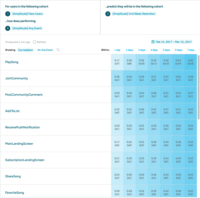
Amplitude is a product analytics platform that can be used to track in-app events, store rich user profiles, and display how events are tied to early retention
In the example above, product data shows that users who played a song or joined the community are the most likely to still be around two weeks later.
Taking it a step further, data from APIs like Clearbit can be used to enrich user data to include fields on the industry, company size, and other criteria you can use to create segments of users. With this information, you can focus on the behavior flows of the most successful users and build walkthroughs that encourage other users to take the same actions.
As we’ll look at later, metrics on the performance of product walkthroughs can be fed into analytics platforms using Chameleon's integrations with Heap and Amplitude, where you can get a birds-eye view of how both your product marketing and app engagements impact retention.
Find the “Aha!” moment with user testing
To discover the “Aha!” Moment, you have to observe your users; their actions, and reactions. You have to understand the "why": why they did what they did, and the "how: how they felt taking these actions. This will help you quickly understand what you need to address with your product walkthrough.
The best way to do this is with user testing and interviews and other direct interaction.
“It can be very valuable to have lots of co-developers random-walking through the design space near your product. Consider the way a puddle of water finds a drain, or better yet how ants find food: exploration essentially by diffusion. Given enough eyeballs, all bugs are shallow.”
– Eric S. Raymond, The Cathedral and The Bazaar (1997)
These words – describing how dedicated beta users can surface issues with a product faster than any of the team who built it – also apply to finding your product’s key retention drivers or things that keep users from becoming successful.
Early on in Chameleon’s growth, the founding team saw those benefits of having regular product-focused check-ins with customers by engaging with a core community on Slack to help improve features and discover how to make other users just as successful.
Another way to get user testing on-demand is to use a platform like UserTesting.com. For insight on the behavior that leads to retention through your product’s onboarding flow or on a specific feature, you can deploy tests with task-based focuses, to defined audience segments.
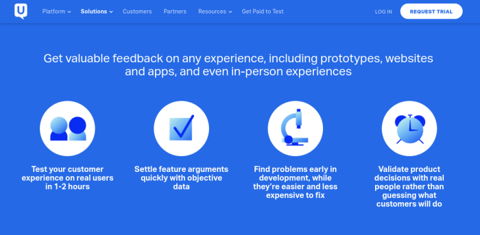
The key benefits of using a dedicated testing platform
Outside of a formal service, you can collect product experience feedback from your team, friends, and family, as well as local meetups.
The goal of analyzing data and user feedback is to formulate a specific hypothesis. It may also mean that you find multiple different user personas or use cases, and these may require targeted and customized product walkthroughs.
For example, Trello asks users for their main use case before showing them the relevant first-time user experience.
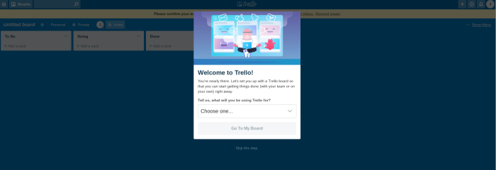
Trello's welcome page modal shapes users' product walkthrough by asking them to define their key use case
Depending on the use case Trello shows a sample board and encourages users to interact with it to learn
2. The CONTENT #
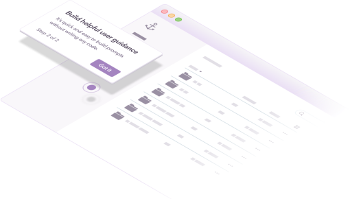
With product marketing tools like Chameleon, you can deploy interactive product walkthroughs without writing code. This means you can point to elements on the screen, or direct the user to specific pages, rather than giving instructions in text or having a user follow along to a video.
As well as highlighting UI elements, it’s possible to trigger product or feature walkthroughs based on a user’s activity – e.g., when they click a button, log in for the third time, or message support.
As you consider the content, think about the “Aha!” Moment, and reflect on what is preventing all users from reaching it.
The reasons might be one or a combination of the following:
Users being completely unaware of a feature
Users missing the perceived value to them
Users not taking a key step to succeed
Users considering this to be someone else's job
Users over-estimating the work required to succeed
Users encountering something they consider an error
Users not understanding terminology
Your content should directly address this to provide users the armory and motivation to continue along the path until they reach the “Aha!” Moment, and eventually the Magic Number.
Malcolm Knowles’ principles of learning state that adults learn best through experience, when the knowledge is immediately applicable, and when users know why they’re learning something. This makes in-product walkthroughs that directly relate to the interface – and explain the benefits of using a feature – better tools for educating users than email or static help documentation.
You can make product walkthroughs available on-demand with self-service help docs.
3. The TARGETING #
Contextual UX performs most effectively, and we know from experience that personalized content resonates more than cookie-cutter copy. While a generic product walkthrough might perform reasonably well for most users, a highly targeted walkthrough will be better.
You can start with targeting the most common user persona or journey and then build variations of the walkthrough for other cases. Leveraging user data from your product analytics, CRM, or Chameleon itself, you can deliver walkthroughs to specific segments of users.
For example, users that are:
Stuck with a feature
Brand new
Not using a new feature after X days
Showing signs of churn
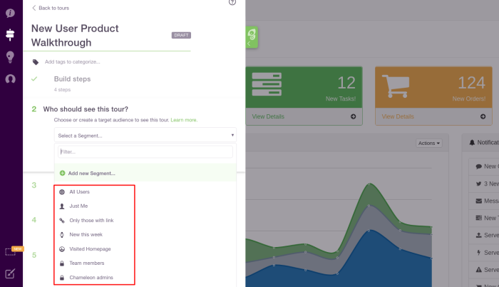
Chameleon provides smart default audiences and allows you to create a custom audience based on user data to target your product walkthroughs
Targeting can help improve the relevancy of your walkthroughs and avoid desensitizing users by overloading them with information.
You can also personalize the content with merge tags, e.g. addressing a user by their name, or referencing their company name. This makes the product walkthrough more appealing and engaging.
How to test your product walkthroughs #
Just as you’d want to use user data and test feedback to inform your walkthrough’s content, you’ll want to run tests on the walkthrough after it’s been built, checking everything from spelling to persuasiveness.
Stage a tour for internal testing #
The quickest way to get feedback on your product walkthroughs is to get people from your team and organization – sales, marketing, support, and any other teams you can get to give the walkthrough a try themselves.
You can deploy your tour to a staging server, or make it accessible only via a secret link if you build it with Chameleon. This is great for sharing with select customers or your team, but you can also select the Team Members segment to show the tour only to those users.
To make this worth your company's time, it's best to make tests objective and easy to provide feedback on. To capture structured feedback, you could try a questionnaire through a form tool like Typeform.
Create serial testing tours #
Comparing two walkthroughs, or a walkthrough vs. no walkthrough is most accurately done with A/B testing. But it's not always possible to get statistically significant data, especially if you're after fast results or have a small user base.
Serial testing solves this problem at the cost of accuracy. Simply measure your metrics with and without a walkthrough, or walkthrough A for one month followed by walkthrough B.
After you get your rough benchmarks, you can begin to iterate on smaller walkthrough elements like microcopy, colors, sequence, etc, with A/B tests.
Use A/B testing tours #
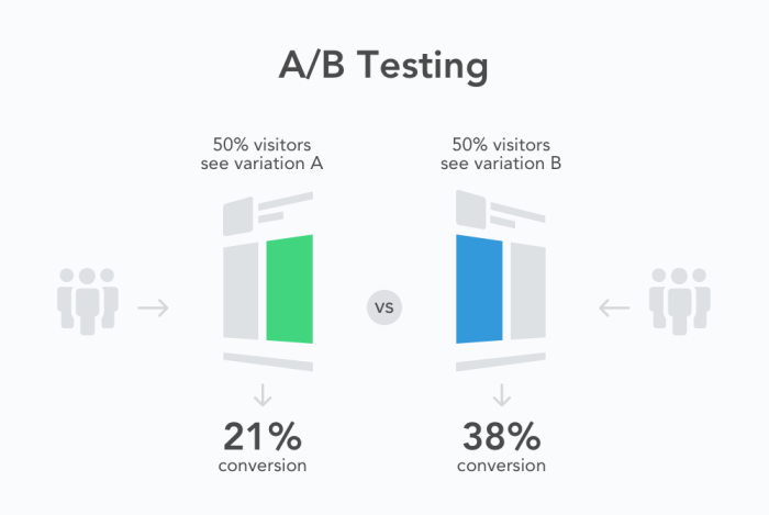
An A/B test on a product walkthrough involves deploying two separate versions of the walkthrough to two distinct sets of users so that neither set of users sees both.
A/B testing gives you the most reliable idea of which walkthrough is performing the best because all other user conditions are the same apart from the walkthrough; any difference in metrics between group A and group B can be accurately attributed to the walkthrough.
Looking for inspiration, best practices, and expert guidance? We can help. #
There’s no one-size-fits-all answer to how to build a product walkthrough – it’ll vary depending on all of the factors mentioned above. Since it’s unique to each product, we offer consultations and recommendations when you request a demo.
We’ve also put together a big library of examples for your inspiration, which features tooltips, tours, and onboarding experiences.
Like many aspects of software, the best starting point is a rough prototype that you improve upon iteratively. Check out our tips for building user onboarding, and go through our crash course, the Best Practices Academy.
Oh, and did you know that you can A/B test your product walkthroughs with Chameleon? You can then send performance data to wherever you usually store customer analytics and monitor everything through the Chameleon dashboard.
Boost Product-Led Growth 🚀
Convert users with targeted experiences, built without engineering
