


Do wonder whether your Product Tours are really seeing the engagement they deserve?
Product teams work on trial and error, running experiments to determine whether guidance like tooltips and user onboarding tours are being used or ignored.
Since the Product world has never seen a large-scale study on in-product guidance to set best practices and benchmarks that are backed by real statistics, at Chameleon we decided to analyze our wealth of data and put it together in this report.
In this post, we look at a few of the report's insights.
To download the full report now for free, just enter your email below.
Download: Product Tour Benchmarks & Best Practices
Build better tours with insight from 15 million user interactions
What We Learned Analyzing 15 Million Product Tour Interactions
Inside, we extract insight from SaaS companies of all sizes, from a few hundred MAUs to tens of thousands.
This groundbreaking study reveals the industry benchmarks behind in-product guidance, and answers questions Product teams have never before been able to get data on. Questions like:
- How many users see Product Tours through to completion?
- How often do users take multiple tours in a session?
- How effective are checklists for tour engagement?
- How does tour length impact engagement?
- How long do users spend on Product Tours?
- How does a tour’s design impact user engagement?
- How does a tour’s trigger and context impact engagement?
For a preview, here are a few of the report's highlights.
Report Highlights
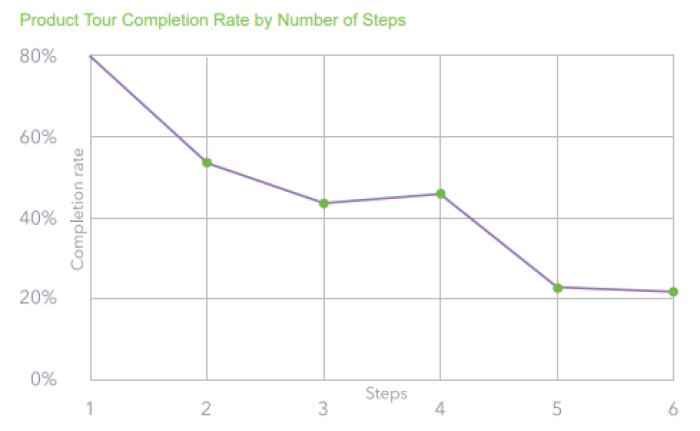
The average completion rate for a Product Tour is 61%
Product Tours won't be as effective if users don't engage all the way through to the end. We found that just under two thirds of users complete Tours they start, but this number can vary drastically. It all depends on the Tour's design, length, and context.
What We Learned Analyzing 15 Million Product Tour Interactions
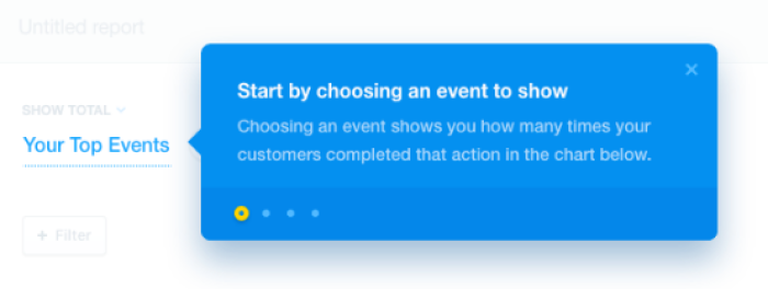
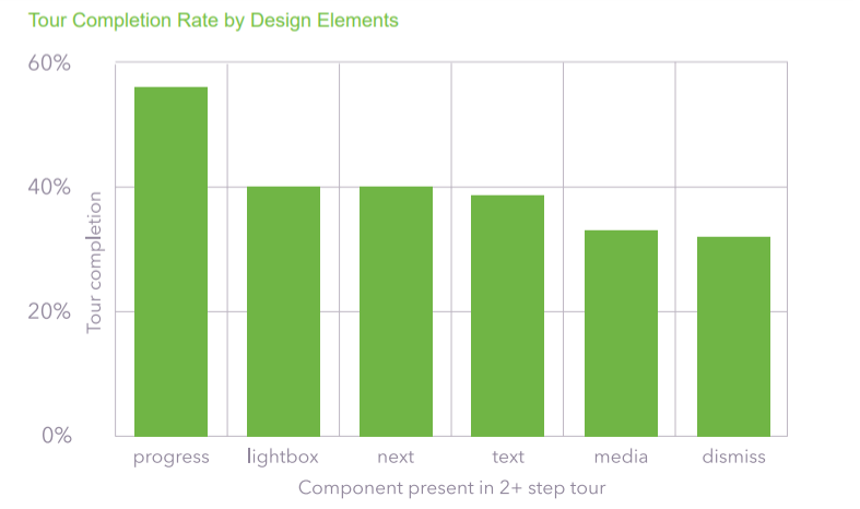
Progress indicators improve tour completion rate by 12% and decrease the rate at which a tour is dismissed by 20%
What We Learned Analyzing 15 Million Product Tour Interactions
Other design features like lightboxes, media, and hotspots also have an impact on user behaviour; download the full report to learn more.
Self-serve tours see a 123% higher completion rate
A tour's context makes the difference between a tour being relevant and requested, or appearing at random. Building the option for guidance into your product - by, for example, adding a hotspot-triggered tooltip to a button - is one of the most effective ways to ensure it isn't ignored.
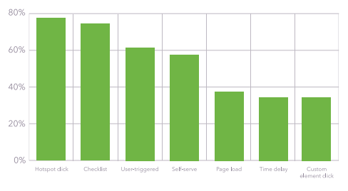
Tours triggered by checklists are 21% more likely to be completed
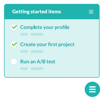
Whether they're used for user onboarding, feature education, or something else, checklists are a powerful way to keep users motivated and engaged.
We found that Product Tours triggered by checklists are not only 21% more likely to be completed than average, but also see 60% of users go on to check off multiple tasks and take multiple tours.
Read the full report for free
Learn more about all of these data points and many more by downloading the full report below:
Download: Product Tour Benchmarks & Best Practices
Build better tours with insight from 15 million user interactions