


Product-led growth is a hot topic in SaaS. As buyers do more solo research, compare more solutions, and make decisions before contacting reps, we're seeing a shift in focus from sales-driven conversion to triggers inside the product itself.
The old way – using armies of reps to convert prospects – can be inconsistent and expensive when compared to the product-led alternative:
Contextual, relevant prompts based on the user's signup date, behaviour, or segment.
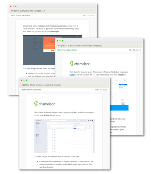
In this article, to celebrate the product launch of our new gallery of Product Marketing examples, we look at some major use cases for the different kinds of in-product marketing deployed by top SaaS companies.
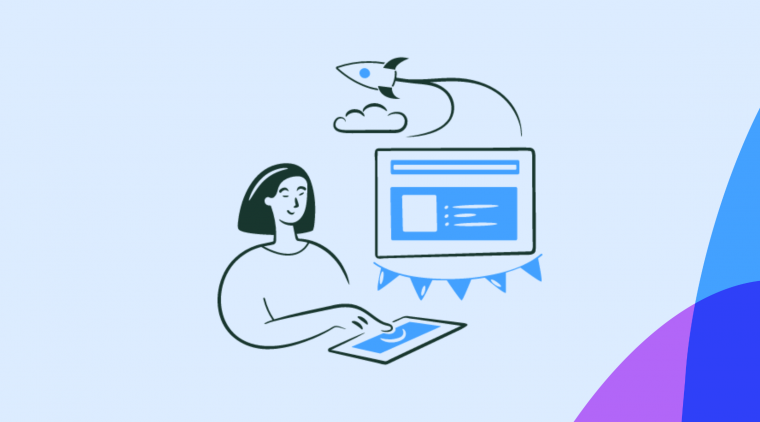
Free in-product marketing mini-course
Learn feature launches, upsells, and onboarding from products like Stripe and Dropbox. Get lesson #1 now 👇
The best product marketing examples and use cases #
Find in this lists the best approaches to product marketing, and what we can learn from each of them. If you think we've missed any case from the list, let us know in the comments.
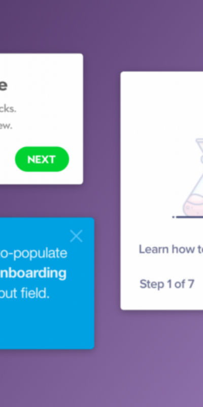
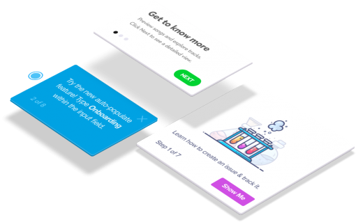
The User Onboarding Tour #
Increase activation by guiding users to new value.
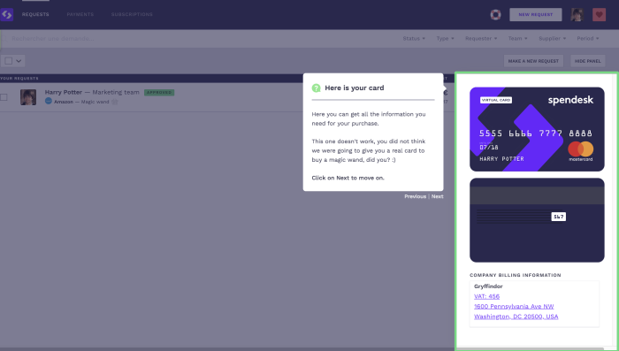
User onboarding is the process of actively guiding users to the new value. It can take the form of email marketing, customer success calls, or – the context we've found converts best – inside the product itself.
Fresh signup exploring your app for the first time is in a fragile state. They could be evaluating multiple solutions, or still unsure whether they're going to get the value they expected. Effective user onboarding campaigns (like the one above from Spendesk) orient new users, sell them on the product's benefits, and reduce churn in the process. This is especially important for SaaS, since 40-60% of new users log in once, and never again.
Make sure to check out the rest of Spendesk's 7-step tour here.
The Feature Announcement #
Drive feature adoption by making announcements in the context.
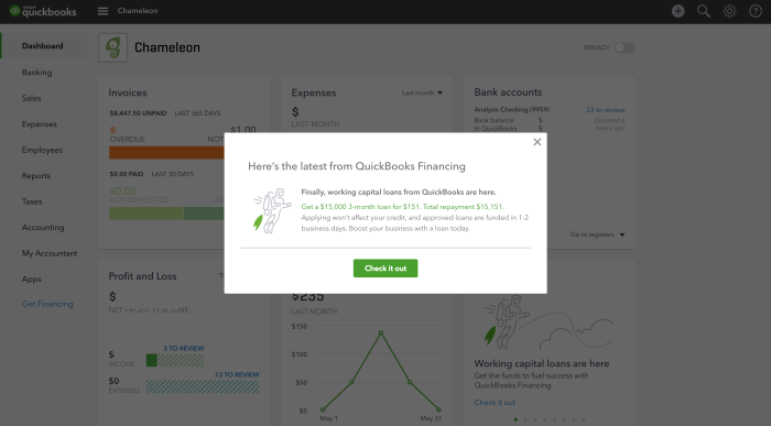
New features can easily be missed by users. If they don't read release notes or study your app's UI, they might not be aware that a feature exists – especially if it wasn't announced effectively.
Like onboarding, a powerful channel for feature announcements is in-app. That's because users don't have to switch context from an email announcement or blog post to try the feature out.
In the example above, Quickbooks uses a concrete offer to announce a new feature. This solidifies exactly what the feature does, and appealing to the part of the brain that responds to an offer of $15,000 on demand.
The modal is shown when the user lands in the relevant feature for the first time since launch; being patient and showing announcements to users when they're in context can help them be more motivated to take action because the goal is fewer clicks away.
To learn more about effective announcements, read this guide, which includes a framework for planning and executing new feature launches across multiple channels.
The Feature Gate #
Convince a user to upgrade, and educate them on plans.
Upselling inside the product works by leveraging a user's momentum to offer more value on a higher-priced plan. Triggers to upgrade can be deployed on the pricing page (highlighting an expensive package as more desirable), in emails (free trial ends soon), or inside the product itself, like the example above from Bitly.
A feature that is always present in the UI – regardless of the user's pricing tier – is more likely to be discovered and used as a reason to upgrade. The fact that a user is trying to use a feature could show they have a need for it and are more likely to convert if given a contextual, benefit-driven prompt.
The Feature Adoption Tooltip #
Promote hidden functionality to get users deeper into the product.
Tooltips are subtle, one-time-use messages usually attached to a part of the interface. They're great for highlighting lesser-used features and delivering bite-sized information without taking over the screen.
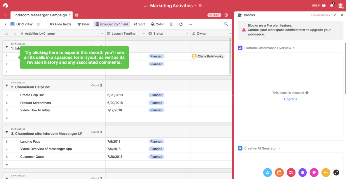
In the example, Airtable is communicating to new users that there's a whole hidden layer to the app that they haven't explored yet; the grid view is just one part of the interface, and users will better understand how the product is structured when they use the suggested feature. For me, discovering you can expand records was my first Airtable aha moment!
Don't waste time building Tooltips from scratch
Chameleon lets you design and change tooltips on the fly, without code.
The Redesign Announcement #
Help ease friction when introducing interface changes.
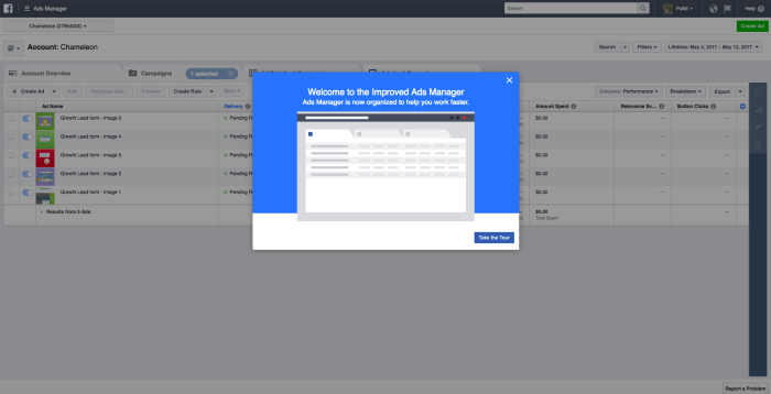
A new design introduces friction for users. It takes some change management to help users adjust to new buttons being in new places or an unfamiliar aesthetic.
Redesigns can be met with resistance because the brain is programmed to react with suspicion when something very familiar changes. It's obvious from Google suggested searches that there's a lot of pushback when a big tool like Facebook changes its UI!
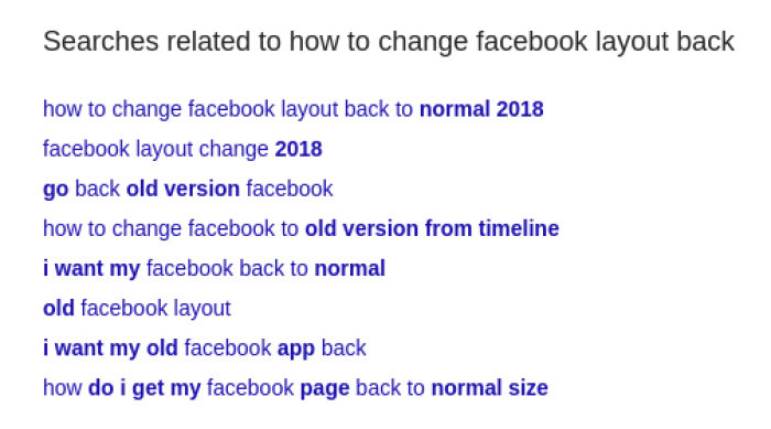
Depending on how radical the change is, Product teams might deploy anything from a simple modal that warns the user, to a full interface tour. In the example above from Facebook, the product uses a light boxed modal to reassure users that the change is positive ("improved" UI, "organized to help you work faster").
The Onboarding Checklist #
Show progress as it happens to keep users motivated.
Checklists are simple tools, but the power they have to motivate, educate and convert is has been proven all throughout history.
Psychologists have found that checklists work by making unfinished tasks stick in the user's brain and beg to be completed. Checklists also stimulate dopamine production in the brain, making you feel great when you tick off an item! ✅
In The Checklist Manifesto, surgeon Atul Gawande found checklists to be the best tools for keeping work efficient and error-free. And, let's face it — learning a new tool as a user is work.
By providing users with a structured list of setup tasks and a progress bar, products make it more likely users will take action towards key activation milestones like completing account setup or sharing a file.
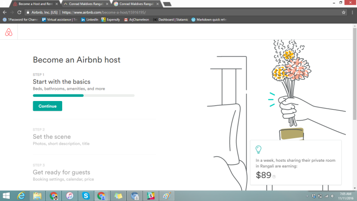
This example from Airbnb seeks to simplify what would otherwise be a very long, boring form; Airbnb hosts can't get much value from the platform if they don't create a listing, but uploading photos, setting pricing, and writing copy is no small task for a new user.
To combat churn, Airbnb turns one gigantic task into several small ones, with an encouraging progress bar and clear, broken-down steps. A prompt in the bottom right gives insight into what other users are earning, to further reinforce that the setup tasks are worth doing.
The Trial Upgrade Banner #
Convert trial users with offers and deadlines.
Banners are versatile; they can be used to announce changes, promote a launch, and deliver offers. Banners are also non-interruptive and great at reminding users to take action without bombarding users with popups.
A common use case for banners is to keep users informed they're on a trial and prompt them to upgrade plans.
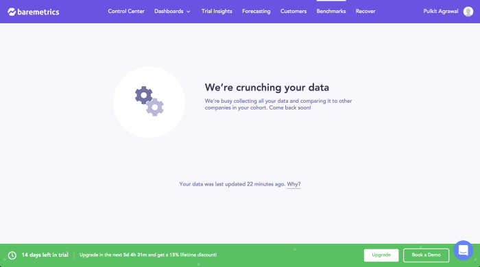
This example from Baremetrics offers a lifetime discount to users that upgrade earlier. Since there's no reason for users not to leave upgrading to the last moment, Baremetrics leverages FOMO and a time-based offer to improve conversions.
Get more inspiring banner examples in our gallery of Product Marketing examples.
The Taxonomy Tooltip #
Demystify product-specific concepts and terms.
Product Marketing isn't all about pushing for conversions; by helping users understand the concepts and terminology used in your product, you're training them to become successful and more likely to retain. You're also easing the anxiety that comes with encountering unfamiliar jargon.
Tooltips are a great medium for explaining taxonomy because users are learning contextually instead of referring to a help document and breaking momentum.
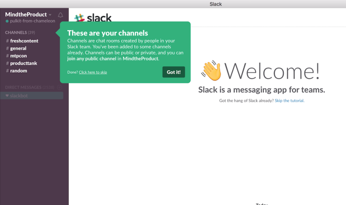
The example above from Slack has become one of the most referenced and praised tooltips on the web. It inducts new users to the IRC-like world of Slack by comparing channels to something users might be more familiar with: chat rooms.
Watch the video below to see how you can create tooltips like Slack's – completely code-free!
Want even more examples and teardowns? #
We've put together a tiny email course to inspire you to build better in-product marketing, from feature launches to onboarding. Check it out below! 👇
Free in-product marketing mini-course
Learn feature launches, upsells, and onboarding from products like Stripe and Dropbox. Get lesson #1 now 👇
