


Most product managers know the importance of user onboarding and how critical it is to retain customers or convert customers from a free trial to a paid plan. However, just how important is UX when it comes to the user onboarding experience?
This article will highlight just how heavily UX design can influence your user onboarding processes and affect the overall user journey. We’ll also look at the best UX/UI design practices and examples and how you can apply UX/UI patterns to new feature releases.
User onboarding UX is the first experience a new user goes through when they start using your product.
There are many benefits to great onboarding UX including lower churn and higher conversion.
Onboarding UX encompasses a broad range of patterns such as welcome messages, product tours, and many more. Check them all below.
We'll also walk you through 12 best practices and examples to help you create an outstanding onboarding experience for your users.
What is onboarding UX? #
User onboarding UX is the first experience a new user goes through when they start using your product. The user onboarding experience is crucial in making sure first-time users continue to use your tool, and it often guides them to their “aha!” moment as quickly as possible.
Onboarding UX/UI design encompasses every experience the user has in their onboarding process. It determines the relationship they develop with your business, the length of their user journey, and their sentiment towards your tool.
The benefits of great user onboarding UX #
It’s critical you provide a delightful in-product onboarding flow for new users. Your onboarding UX flow is the first time a user has ever really been alone with your tool. It’s the moment when your marketing and sales team step aside, remove the bells and whistles, and say: this is it.
Below are some of the numerous benefits brought on by investing in your user onboarding experience.
Higher user retention rates #
The more your users interact with and understand your product's value, the more they are likely to stay and keep using your product. For that to happen, you need to educate your users early on with good onboarding tours and walkthroughs.
Lower churn rates #
Users abandon products they can't find value in. This could happen because users are simply not aware of the full extent of your product's capacities. Onboarding UX that guides new users ensures that users realize the full potential of your product.
Higher free trial to conversion rates #
The goal of a free trial is to convert a new user into a paid customer, which means you need to convince first-time users that they need to invest in your product. An excellent user onboarding experience can be the solution to persuading users to commit.
Higher referral rates #
Word of mouth is one of the most powerful marketing forces, and it's the same with SaaS products. Great onboarding UX is more likely to lead to happy users, and these satisfied existing customers will be more encouraged to sing their praises to others.
Higher engagement rates #
You can't force users to engage. They have to be encouraged, incentivized, and good onboarding UX does just that. It prompts points of user interaction to deepen their product adoption.
Increase in LTV #
Higher retention and less churn mean that paying customers are more likely to stay with your product for a long time, pushing the customer lifetime value (LTV) up. But that's not all. Users familiar with how valuable your product is are more likely to upgrade their plans. All of this starts with good onboarding.
Higher NPS #
When you invest in the customer journey and offer highly effective onboarding flows, that leads to a better understanding of the product's value, which in turn leads to higher customer satisfaction. If you're getting a much better NPS score from your users, that means you're doing onboarding right.
Many of these metrics will determine the overall success of your business and will be a KPI for year-on-year revenue growth.
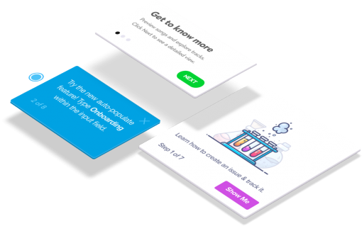
Common onboarding UX patterns #
In order to create an amazing user onboarding experience, first you have to be familiar with various onboarding UX patterns that can help you build delightful onboarding experiences and drastically reduce the users’ time to value.
There are a few UX and UI patterns you can pick from that will help to design your onboarding flows and build the perfect user experience for newcomers.
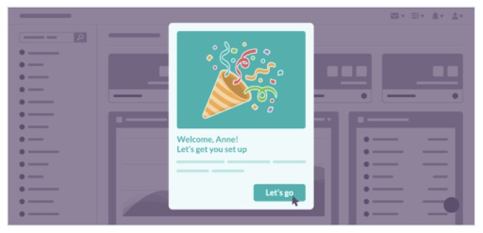
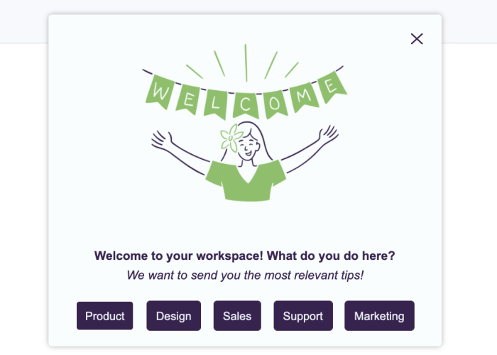
Welcome messages #
First impressions are important, and it certainly counts when it comes to the user onboarding process. The welcome message kicks off the user journey, not only inviting the user in with a friendly greeting but also giving the user a first opportunity for action with a CTA.
Don't keep it too long, though. Make it brief and move your users along, just like in this example welcome message below, built with Chameleon.
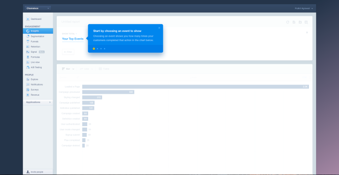
Product tours #
Product tours show users around your tool and showcase what they can do with it. Tours are usually formed by a combination of various UI patterns, whether these are modals, highlights, or side popups. The important thing to remember about product tours is that they are supposed to move new users through the product step by step, thereby boosting product adoption. Here's what a Tour built with Chameleon could look like.
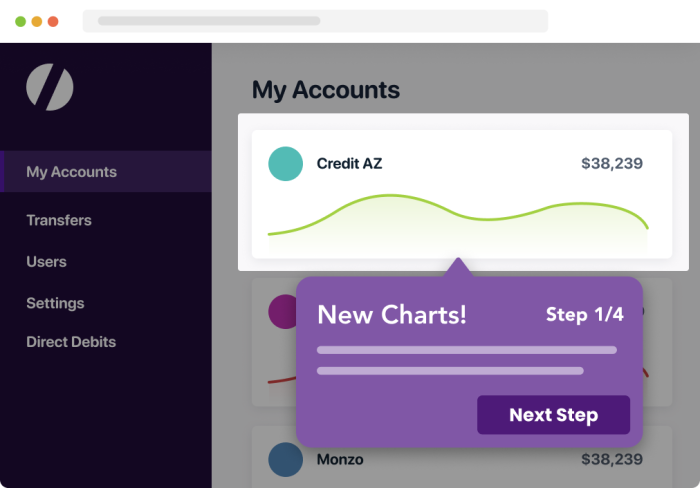
Progress bars #
Gamification is a very effective way to motivate users, which is why it is perfect for onboarding. A common user interface pattern that leverages gamification is progress bars. They let a user know how far along they are until completion, which encourages users to continue. Here's how Pipefy used a progress bar with Chameleon-built Launcher.
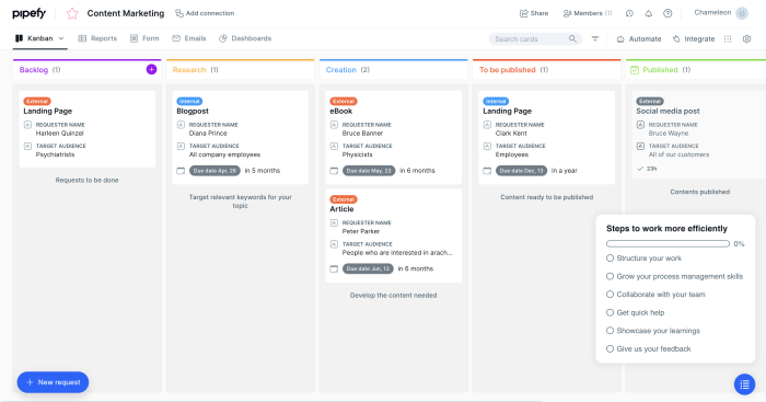
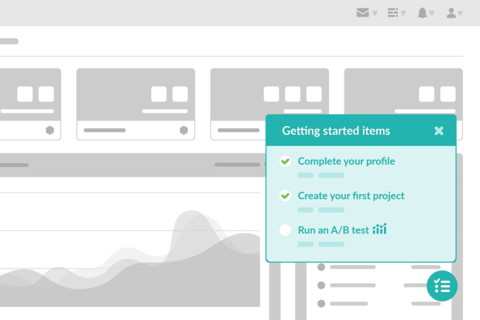
Onboarding checklists #
A good onboarding process never lets users get lost within the product. One of the best onboarding UX patterns to guide users effectively are onboarding checklists. These in-app widgets show users what parts of the onboarding flow have been finished, and what is left. When built with Chameleon's Launchers, this is what a checklist could look like.
Onboarding surveys #
User feedback is of utmost importance when it comes to delivering a great onboarding flow, particularly for tailoring the user experience.
This is where in-app surveys shine. They can be used to simply collect feedback on how the user finds the product experience, or obtain information that can help you segment users for personalization, such as a welcome survey that builds user persona. Just like this Chameleon-built Microsurvey below.
Banners #
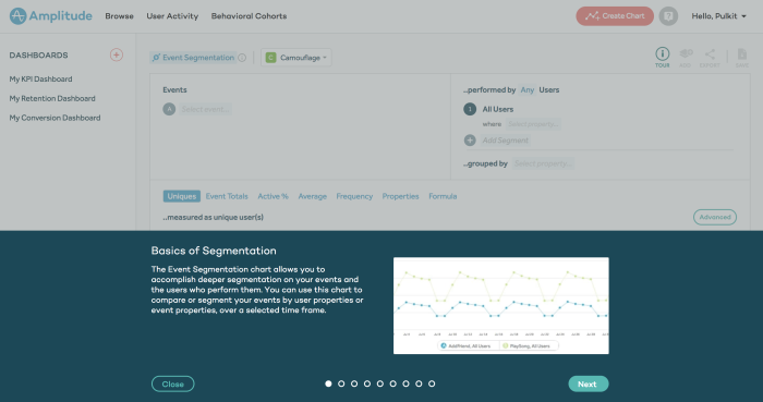
Banners are very versatile onboarding UX patterns. They can be used for a variety of purposes, and they draw the user's attention while not disrupting the user experience too much. They can also be more extensively used like how Amplitude fit their feature tour all within a bottom banner.
Tooltips #
Tooltips are in-app UX patterns that deliver small bits of information regarding your product's features. When used for your user onboarding, they can guide and educate users efficiently, leading to higher adoption, like this Mixpanel feature onboarding tooltip below.
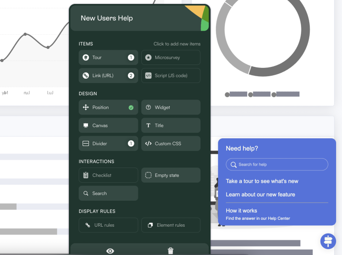
Self-serve help menus #
User onboarding is not a linear experience, and it is best achieved when users can go at their own pace. Having in-app widgets where users can easily access self-serve resources can enhance the onboarding experience, giving users instructions and help whenever they need it while using the product. If you create it with Chameleon's easy-to-use Builder, this is what it could look like.
The onboarding patterns we’ve mentioned above are just a few to consider within your onboarding flows and at the beginning of the user journey. These patterns are consistently seen among SaaS brands that are leading the market.
Want teardowns of the best examples? Get the 6-part series now 💌
12 user onboarding UX best practices (with examples) #
Now let’s look at some best practices you should apply when building your own user onboarding processes.
1. Build a relationship with your new users #
User onboarding is about winning over customers for the long term. So make that more of a possibility by getting to know them. Establish a relationship with your users by asking them what brings them to your product, and what they’d like to use it for. Just like Trello does in this example.
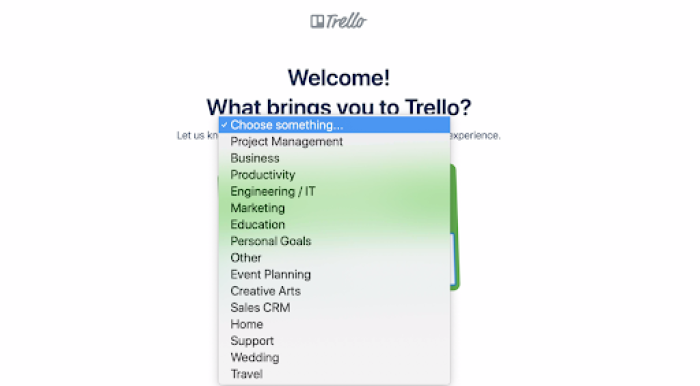
Trello does a fantastic job at getting to know its first-time users throughout their onboarding journey. Trello doesn’t stop at getting and using someone’s name; they understand why someone is using the platform and what they hope to get out of it.
As mentioned in Trello’s onboarding case study from Growth.Design, Trello reported a 36% lift in activation using a mix of personalization tactics in onboarding users. By getting to know someone better, Trello is building a relationship with the user and tailoring the onboarding experience.
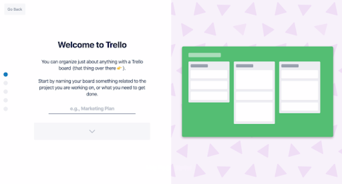
As you can see in the screenshot above, the example board name is what Trello suggests after users say they intend to use Trello for marketing. It’s a small touch that makes the app more relevant to the user and encourages a longer customer lifespan.
Trello also manages to add a touch of personality, a playful way to introduce its user interface, and incorporate a completion bar on the left-hand side of this onboarding screen—all of these are great UX features to create happy users.
2. Personalize the onboarding UX #
Every user’s path is different because their needs are different. For you to be able to connect your users to value, you need to customize the onboarding UX for each user.
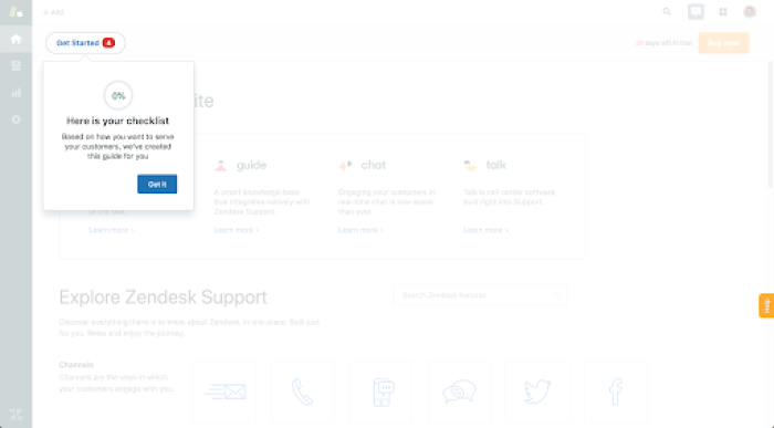
In the example above, Zendesk utilizes checklists to give users a better overview of the experience they’re about to have and create an interactive walkthrough.
But they don’t stop there; Zendesk takes things a step further by providing checklists tailored to customer needs. Their ‘get started’ checklist is a fantastic example of managing expectations and ensuring the completion of the user onboarding process.
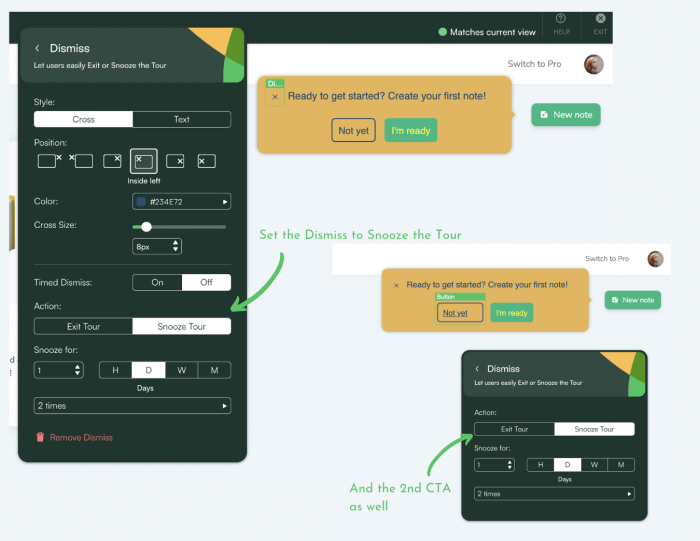
3. Keep your user onboarding optional #
Sometimes a user wants to just explore their way through your product, so let them. Don't hold your users hostage. Give them an easy way out of the onboarding experience.
As an example, Datacamp keeps things simple with their onboarding UX and starts with a “hello”. They manage expectations and introduce the onboarding process and product walkthrough in a single sentence. At the same time, they manage to deliver a dose of their brand personality too.
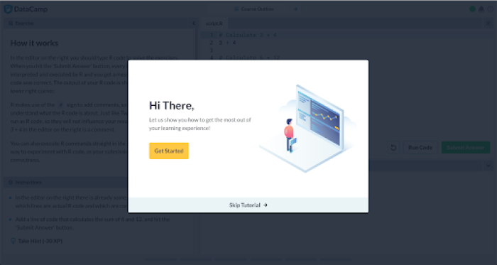
What's more, Datacamp offers users the option to skip their onboarding tour altogether. Perhaps a user doesn’t feel like they need to take it—kudos to your marketing and sales team.
Just know if you do offer the option to skip an onboarding tour, give users the option to pick it up later. You can do this via a pop-up the next time they log in or an email reminder. Or you can use a product adoption solution like Chameleon that comes with a 'snooze' feature to bring the onboarding experience back another time.
4. Blend your user onboarding UX within the product #
Your user onboarding UX doesn’t have to be too in-your-face, and oftentimes it’s much more effective to have them be embedded into the product experience.
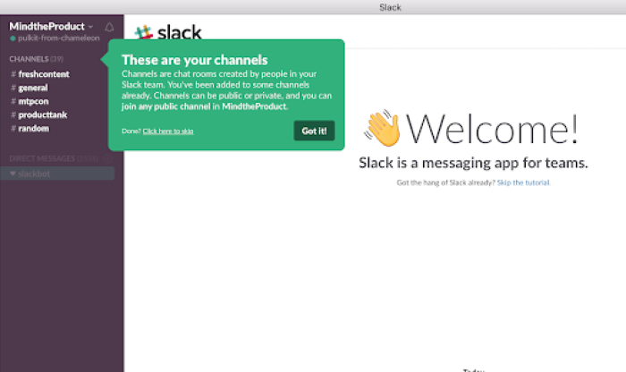
Slack is famous for keeping the user front and center in its communication tool.
Despite their product needing little to no introduction, they still need to educate users to ensure they hang around. Especially considering users need to decide after their free trial ends whether they’re going to continue using the tool or not—product guidance is critical for retention.
Slack uses tooltips as a UX onboarding feature, guiding a user through their product and educating them as they do. Many of their tooltips focus on typical jobs to be done. You’ll notice they try to get new users to achieve their jobs as quickly as possible.
5. Keep your onboarding experience short, but not too short #
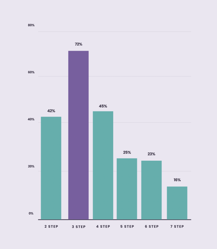
When introducing users to your product, you may want to pack as many onboarding elements as possible so that the user can know literally everything there is to know about your product. But it's good to keep those product tours brief, just enough that the users will find value in your product and know exactly how to get started using the app.
For instance, we analyzed 58 million Tour interactions for our Benchmark Report and found that three-step product Tours are the most likely to be completed with a 72% completion rate. In addition, two-step Tours had a 42% completion rate while four-step Tours had a 45% completion rate, meaning too short may not be the best to give a good onboarding experience.
6. Add media to your user onboarding process #
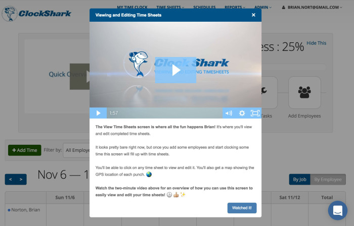
If you want to make the user journey much more engaging, then add media to your onboarding patterns. These can simply be images that add a nice flair to your tour modals, or visual guides that tell much more than just words. For instance, this video modal in ClockShark's onboarding allows the user to get a quick orientation to how the product works.
Or even better, add a video. What does a user need to read, and what are they better off seeing and listening to? Make your video short, sweet, and educational. You want to spark curiosity to use the feature while ensuring users know what to do when they get there.
In fact, our data has shown that a Tour with a video adds an average of half a minute to time spent.
There are some great user onboarding tools that you can use to increase new feature adoption and the user experience, including video tools like Demio or Loom, Segment for customer profiling, and Chameleon for in-app feature onboarding.
7. Say only what you need #
You might be tempted to pack your onboarding flow with as much information as possible. However, long paragraphs can lead to users losing interest.
Our Benchmark Report shows that 25 words per Tour step are the ideal word count. So design your onboarding experience to be as bite-sized as possible, and keep each step brief. Say only what you need to say in order to inform the user.
8. A/B test to perfect your onboarding UX #
No matter how well thought out your onboarding UX is, there is always room for improvement. To find out, you have to test your user onboarding processes, and the best way to do this is the A/B test.
You can do this with an A/B testing platform, or get a product adoption platform that has native A/B testing like Chameleon.
9. Keep it contextual #
If you want your users to discover your product's value as fast as possible, you need to keep your onboarding UX hyper-relevant.
Let's say, if a user is clicking around and behaving as if they don't know what to do next, that would be a good time to push a tooltip to get the user back on track. Or when a previously not shown feature shows up on the screen, you want to give timely guidance to clear up any confusion.
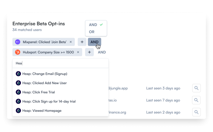
With Chameleon, you can get truly granular with the groups of users you want to target with each in-app experience, as shown here.
10. Onboard continuously #
User onboarding doesn’t end the first time your new users discover your product's value. You'll have new features constantly being released as well as updates, and that means existing users have to be onboarded for even further adoption.
For instance, release notes are critical in announcing new features and getting people excited to use them, such as this example from Stripe.
Building on this, release notes don’t need to be solely for current users. They can be the instigator for lead acquisition or even support a lead conversion—perhaps your feature is just the ticket someone was looking for to become a paying customer.
What is important to remember is that user onboarding is a continuous process. Remember your existing users. Segment them from new users and tailor more advanced and deeper onboarding processes for them. Speaking of segmentation, that brings us to the next bit of advice.
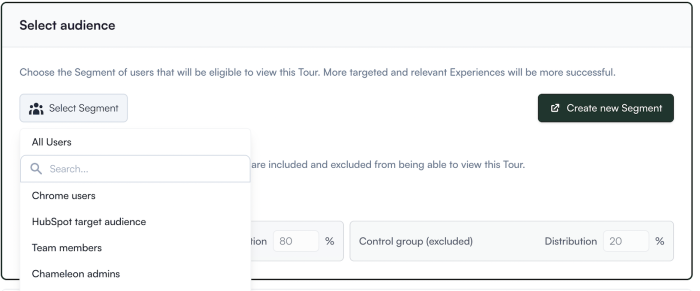
11. Segment your users #
As you know by now, not all users are the same, and what engages one user might not work on another. This is why customization is important, and in order for you to be able to match the right kind of onboarding experience to the appropriate target user group, you need to leverage user segmentation.
This means dividing up your users based on their profiles as well as their behavior. You can also use the aforementioned user personas to identify each user's preferences. Then, create custom audience segments based on different journeys and in-product user behavior to offer a personalized experience. In Chameleon, you can do this in just a few clicks.
12. Deliver real value #
This may sound obvious, but your onboarding experience is going to be effective only if it actually helps the user.
Don't repeat things that have already been said, and certainly don't point out what is already crystal clear. Before you build any UX onboarding patterns, think about how each step is helping the user and adding value to the overall experience.
The user onboarding process doesn’t stop in product #
Remember, onboarding UX doesn’t need to stop with in-app messaging. You can add barriers around your onboarding flows to keep users engaged when they’re out of your product.
Consider extending your onboarding flow to customer lifecycle emails, a customer-only social media group, or any other platform where you have communication set up with your customers.
Onboarding also doesn’t stop with new users. You can borrow certain methods and some new UX/UI patterns to onboard existing users to new features.
Closing this onboarding UX journey, for now #
Successful user onboarding starts and ends with user experience. Remember, your product onboarding is the first time the user is truly alone with your tool. It’s critical to make a good impression (again) and give them the knowledge and experience they need to succeed with your tool.
No matter how long—or short—your onboarding is, this process essentially dictates if a user hangs around or not. It’s the first introduction someone has to a product journey. Catch them while you have the majority of their attention and give them exactly what they need to get to their “aha!” moment quickly.
Create in-app bumpers with Chameleon
Increase activation with product tours, boost adoption with tooltips, get user feedback with surveys, and offer guidance with checklists.


