


Don’t send your users away by boring them with the how! Instead focus on why to stimulate their own self-discovery.

User action is down to 3 simple things
To avoid generating boredom, let’s review why people do stuff: BJ Fogg explains that behavior happens as a consequence of these 3 things:
- Necessary motivation
- Sufficient ability
- Effective triggers
This underlies everything. So when thinking about user engagement, we must consider how this applies to products. Here is how I have translated this for user engagement:
- Motivation → value proposition
- Ability → user interface
- Triggers → prompts

The curve shows when users will engage; there is relationship between how strong the value proposition is and how simple the interface is.
As the value proposition is stronger, users will engage, even with a confusing interface (think Salesforce or Snapchat) and even when the interface is intuitive, users will not engage without a strong value proposition (think every beautiful app that failed).
Users can also benefit from ‘prompts’ that trigger their desire to take action. These are more likely to succeed on the right side of the engagement curve. So when the product has a strong enough value proposition and the interface is simple enough, then a prompt may result in user action.
Therefore user action results from the relationship between the strength of your value proposition, the simplicity of your interface and the intelligence of your prompts.
The most intuitive interface is useless if users don’t understand the value of your product. Multiple prompts are ineffective if your interface is confusing. A strong value proposition is wasted if you don’t prompt users to take action.
What this means for UX
- Don’t ever say that all you need is an “intuitive interface”!
- Think about how to convey your value proposition.
- Re-evaluate what your prompts are and when they are delivered.
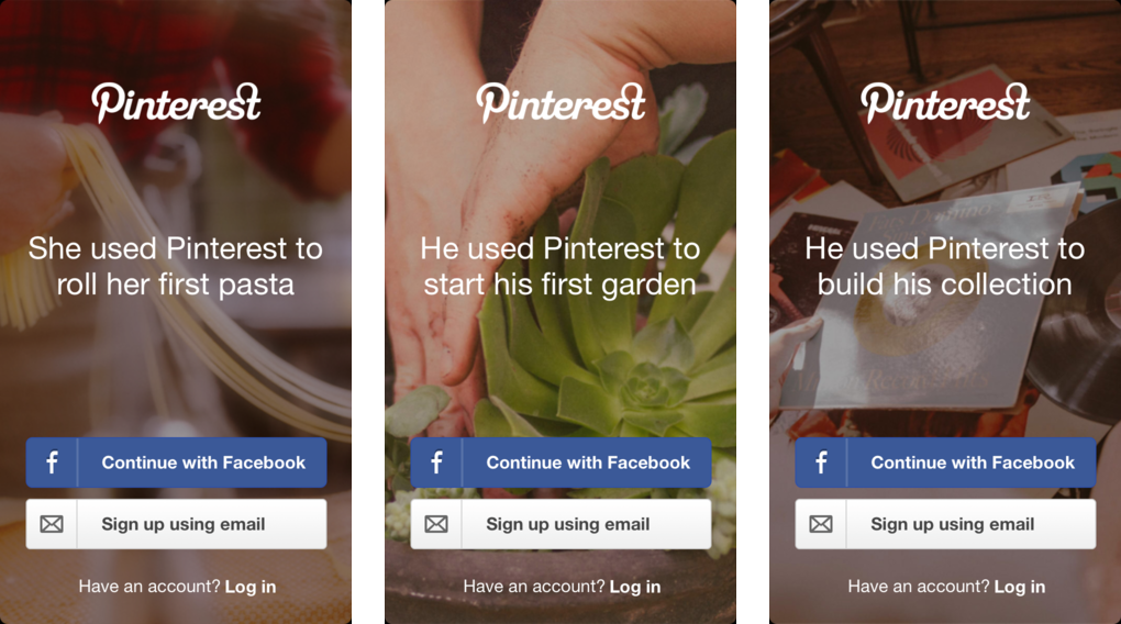
Since I work on making user onboarding more intelligent, and because it’s the most important part of your product design (read this by Julie Zhuo or this by Scott Belsky if you don’t believe me), let’s take that as a good use case to consider this:
This phase is often considered the time to explain how someone should use your product. This assumes users are already convinced of the value proposition and so the focus can be on the interface.
Users don’t churn because they can’t figure it out — they churn because they don’t want to.
You should instead be using the time to explain WHY. Once they are convinced of your value, they will discover a lot of functionality themselves.
Start with the big picture and clearly communicate the benefits of your products. Explain and show the value so that you motivate your users to stay engaged.
With higher motivation people will tolerate the deficiencies in your design, while you work on improving it. You can do this as part of your website, your sign-up flow, your emails, your in-app messaging and prompts (product tours.
Some examples of things you can apply fairly quickly:
- A video from the founder / CEO welcoming new users and outlining the goals of the product (and how it saves your users time / money / effort)
- Customer testimonials as part of your onboarding emails reinforcing the value that others have received
- A quick tour highlighting the most valuable aspects of your interface so users (this provides users high return on investment) -- check out our guide on creating great tours.
Takeaways for your product
Please review your current onboarding (what do users experience during their first time inside your product and in the first week, including emails) and assess how much is about WHY vs. HOW. If you’re doing too much explaining of the interface then shift the focus to the value proposition and over time, work on making your interface more ‘intuitive’.
Building better user onboarding doesn’t have to be hard. Start with copy and make tweaks as you learn more. If you need a quick way to experiment and test in-product tours then I recommend Chameleon - try it here 🤓


