


Believe it or not, in our customer-centric SaaS world there are still plenty of UX mistakes lurking among some of our favorite, day-to-day SaaS products.
Bad UX design is rife, and in this article, we’re about to showcase the best of the worst—if you can call it that. From shoddy onboarding UX and onboarding experiences to poor sign-up flows or missed in-app actions, we’ll be reviewing the lot.
We’ll close out with ways you can identify bad UX in your products, the impact this experience has on your users, and some top UX tips to ensure you’re delivering products that are accessible, usable, and all-around joyful for customers.
What makes a UX bad? #
Confusing customer flows, failed usability or accessibility, ignoring design principles, or not being explicit. There are many fails that make a UX bad.
Streamlined user experience (UX) is something all SaaS products are shooting for, yet not all are getting right. Why? The reason could be bad UX/UI design solutions, irrelevant copy, the wrong look and feel, or anything in between.
Let’s take a look at some of the biggest contributors to UX fails.
A confusing onboarding flow #
Onboarding flows are your product’s first handshake with a user, stripped of the bells and whistles of your product marketing team.
These flows are the moment when new users finally get to see your product in its truest light. The only thing you have to lift your product and stop new users from churning is the UX of your onboarding flow.
Onboarding flows that are indirect, not explicit enough, or too long and complicated are either left uncompleted or don’t serve their function.
Failed usability & accessibility #
This pair often comes hand-in-hand, when products don’t consider their usability and accessibility they provide poor user experiences.
Usability considers how easily a user can navigate a product or design to achieve a set goal effectively and efficiently. If users are unable to achieve the defined goal, you’ve got usability issues.
Accessibility considers if it’s possible for all users to navigate their way to a goal. Neglecting to consider how usable your product is for people with disabilities can result in higher churn rates.
There’s ample overlap between usability and accessibility, and it’s essential to strike a balance that ensures your product is equal parts of both.
Not following relevant psychology principles #
A product shouldn’t only serve its function. The functions should serve the users.
Include UX/UI designers, engineers, UX writers, and UX researchers into the development process to ensure that you're building features that rely on relevant principles of design and user psychology.
Your team should act as customers’ internal ambassadors. They can support your users by applying some of these principles:
Gestalt grouping principles: The Gestalt principles explain how the brain interprets and groups individual images. Applied to UX design, they help build human-centric products, enhance user experience, and increase product engagement.
Color psychology: This will ensure that the colors you are using are compatible with each other, that the color contrast is high enough to make the experience accessible, and that the colors are conveying the right message.
Hick’s Law: This law describes the time it takes for a person to make a decision when given multiple choices. The more choices there are, the longer it takes to decide. In other words, you should be mindful of this principle not to overwhelm users with too many choices.
Mental models: Keeping in mind that every user has their own mental models—internal beliefs about how your product works—will help you offer additional information or explanations exactly when and where a user needs them to be able to complete their tasks the right way.
These are some of the UX principles that have been developed using psychological laws and theories. User experience has a lot to do with user psychology, and these principles help implement tried-and-tested, scientific approaches to UX.
Undiscoverable features #
For as great as your new features are, they won’t make any difference if they’re not discoverable.
Some of the worst user experience examples are presumptuous, assuming that users will know their way around products and that they will notice changes, like new buttons or navigation options.
You can notify users about new features in many ways, but if you’re not adding in-app notifications to the mix as well, you might be missing crucial UX opportunities.
Boost product adoption with in-app messaging
Get started free with Chameleon and harness the power of product tours, tooltips, checklists, and surveys.
5 bad UX examples and how to improve them #
Now that we’ve covered what warrants bad UX, let’s get into some real-life bad UX examples. Even the best among the best can sometimes fail to deliver an exceptional experience.
Here, we’ll explain why these examples are bad and how each can be improved.
Example #1: Google Data Studio’s onboarding tutorial #
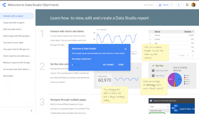
Google typically offers clear and well-structured product tours, but with the Data Studio’s onboarding tutorial they created a pretty noisy page experience.
What makes it bad: There’s too much going on. The page feels distracting, with no clear direction. A new user ends up not knowing where to start, where to look first, and where to go next.
Plus, offering a 6-step tour and post-in notes while already having an intuitive navigation bar, clear side panel, and dashboard visualizations with textual explanations leads users to feel overwhelmed and give up before they’ve even started.
How to improve: A better version of this onboarding tutorial could include a simplified three-step tour pointing to the important pages in the side panel and leaving users to move on without hand-holding them through each point.
In fact, our latest Benchmark Report shows that – with a 72% completion rate – tours with three steps are the most popular among users, while only 23% of tours with six steps get completed.
Google could also improve this onboarding experience by greeting users with a welcome message and product tour that borrows from the Gestalt grouping principle: figure-ground principle. They could implement this the modal principle by blurring the product interface and drawing into focus.
Example #2: Orange’s in-app messaging #
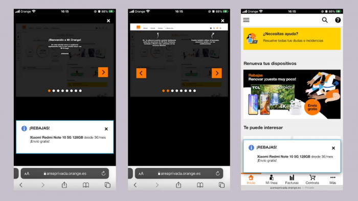
Here, we’re looking at a few screenshots from the Orange web app on mobile (in Spanish): an onboarding tour with a sales notification pop-up, the second step of the guided tour, and the home page with the same sales pop-up.
What makes it bad: Once again, it’s not clear where to start. In-app messaging is hard enough, but delivering in-app tutorials is another beast altogether. Orange has offered a not-so-pleasant experience because they haven’t adapted the onboarding tour dimensions for mobile users.
There are too many steps within this tour altogether. Plus, the sales pop-up repeatedly pops up on every page. Lastly, it’s a visual overload of colors, notifications, and navigation options.
How to improve: Put simply, Orange could turn it down a notch. A more simple approach to onboarding is sure to result in a better in-product experience. A shorter, mobile-friendly onboarding tour would guide users through the process a lot more smoothly—and there shouldn’t be that pesky pop-up.
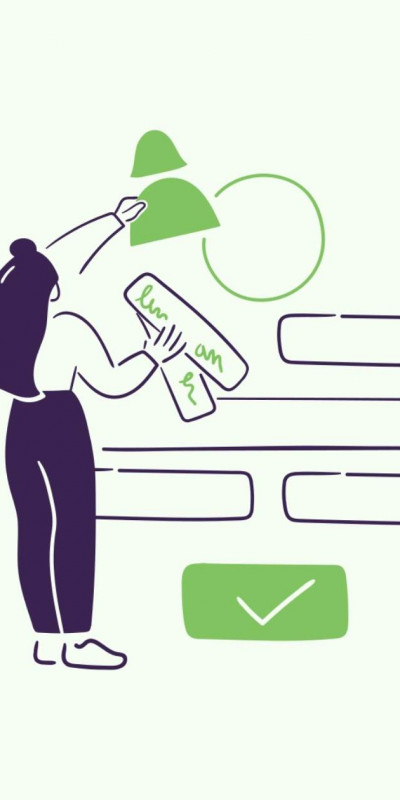
Example #3: USPS confusing form #
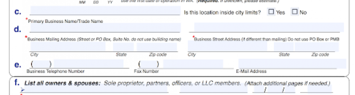
There are a couple of principles that UX practitioners can harp on about for hours—color psychology, the F-shaped pattern, and the 3-click rule are some of them. Another is the Gestalt principles of design that we mentioned above. That’s what we're focusing on here.
Namely, our brain is able to make assumptions about certain visuals and process them better. Going against those Gestalt grouping theories leads to a poor user experience—like the above USPS form.
What makes it bad: It’s confusing. The form doesn’t clearly display what information goes where, and it’s often counterintuitive.
Gestalt theory highlights how the human brain jumps to conclusions based on proximity. Here, we can see that fields c. and d. are closest to the boxes below them. You’d assume this meant that’s where the information goes—but you’d be wrong! The information goes in the box above, despite what your brain is telling you.
How to improve: Group elements better and take Gestalt theory into account. There are six Gestalt UX principles to understand—similarity, continuation, closure, proximity, figure/ground, and symmetry. Each of these can affect user experience. The simple fix here would be to position the text nearest to the box it relates to.
Example #4: Popupsmart’s blocking modal #
Pop-ups can be really helpful. They can also be really annoying. Striking a balance between the two and delivering well-timed, necessary pop-ups is essential for successful user onboarding.
Whether users are learning to use a new feature or taking the first explorative steps on your website—they don’t want to be confronted with a pop-up in the first five seconds unless it’s absolutely necessary. There’s a time and a place.
What makes it bad: In this example, we see a pop-up model that appears in the middle of the screen soon after a website visitor starts scrolling through the Showcase page, looking through examples. The modal blocks the page and prevents a viewer from performing any further actions before closing it. Plus, there’s a “cookie” notification at the bottom left, adding to the noise on the page.
The fact that this example comes from Popupsmart, a pop-up builder, only makes it more difficult to understand why they didn’t apply pop-up best practices.
Another unfortunate issue here is the irrelevant copy. The text within the modal calls the visitors to read the blog, emphasizing a “collection of budget decoration ideas” which is completely unrelated to the topics from Popupsmart’s blog—with topics on building and crafting pop-ups that work.
The modal pops up before you’ve even had the chance to scroll down and consider if you want to stay. Using a pop-up in such a manner is off-putting and disruptive. Also, it uses a color palette similar to the background colors, so it doesn’t stand out.
How to improve: This one could perform better as a banner or another type of notification with relevant, compelling copy. To avoid this mistake, understand your users’ jobs-to-be-done to better serve their needs. A pop-up at the right time can be a life-saver—every bit of UX matters. Understanding users also helps identify where you can further improve your UX.
Example #5: Booking’s date picker – form over function #
Our final example focuses on how essential accessibility is to ensure a great user experience for everyone. Some UX isn’t a want, it’s a need.
What makes it bad: Booking’s drop-down travel date calendar is inaccessible to screen reader software, which many people use to navigate the online world.
We spoke to Dale Reardon, CEO and Founder at Travel for All, to learn more about accessible UX.
“As a blind person, I use a screen reader to surf the internet, read the computer screen, navigate websites, and more. But many websites have inaccessible booking forms. Typically, it’s caused by an inaccessible calendar as part of the form—a so-called date picker. A web designer tries to make it look fancy, but it often ends up breaking the built-in accessibility that exists for standard form fields.”
– Dale Reardon, CEO and Founder at Travel for All
This means Dale has to resort to calling to make booking arrangements, with some contact forms also failing on the accessibility front.
How to improve: This example could be more effective by adding the numerical date format into the form field to accompany the date picker and make it readable by screen readers. UX isn’t just about design and creativity, it’s about accessibility and quality of experience, too.
UX mistakes you should avoid at all costs #
Bad UX leaves users feeling frustrated and irritated—neither is desirable. You can’t afford to be making simple UX mistakes, especially when there are plenty of best practices to follow.
Providing a smooth user experience is super important for product success—with 79% of marketers placing website experience and page load time at the top of their list of priorities.
So, what UX mistakes should you be avoiding?
Mistake #1: Information overload #
Making sure your user has enough info is great, but knowing when to stop is essential. You don’t want to go overboard with your product walkthroughs—it’s not a race to onboard users.
Instead, focus on ensuring the onboarding experience is as simple and concise as possible. For example, Canva does a great job of onboarding users. Their simple ‘beginner’s challenge’ invites users to drag and drop a hat onto a monkey. It’s a playful way to start introducing features and build a self-serve product culture.
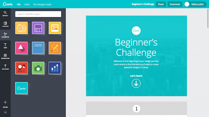
It also makes mention of Canva’s premium offerings—so users know what they’re missing out on. It’s not too much or too little of an upsell. This onboarding flow perfectly guides users towards their aha! moment and encourages adoption and retention from the get-go.
Mistake #2: Non-personalized UX #
Personalization has been a buzzword for as long as we can remember, so it’s no surprise that providing a bespoke experience for your user is good UX practice. It makes a lot of sense—users want to know what features will help them with their job to be done.
By finding out what specific customer cohorts plan to use your product for, you can consider the usability metrics for people in their position who have used the tool—and you can develop specific use cases.
These use cases can help you map out a unique onboarding experience that pays special attention to the features that each user segment needs most.
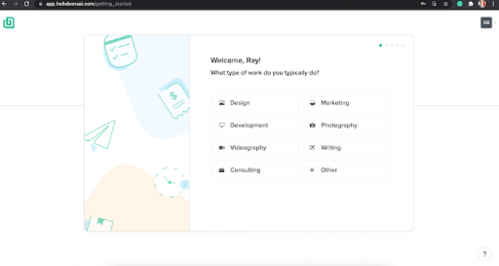
Bonsai does a great job of this in their onboarding quiz. They take the time to get to know their user, as well as to tailor the onboarding experience and product interface accordingly.
Mistake #3: Non-structured self-serve support #
Providing easy, self-serve access to support is key for encouraging fast-moving teams. Nobody wants to sit around waiting for help when encountering error messages or product issues—people want quick and easy answers.
Allowing users to find solutions to their own issues speeds things up, and limits the manpower you need on customer support.
Prioritizing UX in your product interface design is essential for increasing adoption and retention rates, as well as for lowering churn rates. Doing initial research into what your users want from your product will help you in the future with more than just UX—it’s worth the effort and investment now.
Remember: Providing support gets a lot harder as you scale, and having comprehensive support options helps lower abandonment rates by avoiding frustrated users.
How to detect and eliminate bad UX in your product #
You now know that bad UX is a big no-no. However, you need some ways to detect and avoid it. UX isn’t just about how your product looks, it’s about how it feels.
Firstly, to detect issues with your current UX you need to understand user frustrations and pain points. One way to do this is by compiling customer research.
You can detect issues using:
Friction logging: Dive deeper into product analysis to discover issues before they become major problems and proactively fix them. You can use a friction logging technique to understand how your users feel when engaging with certain features. This will help you optimize existing features and create a better user experience.
Behavioral analytics: These are the pieces of data that will tell you how your product is being used and received. To start, identify your key metrics for understanding UX, and use them to discover when and where your users are having an unenjoyable experience. For example, looking at your landing page conversion rate can help you improve your CTA buttons’ UX.
User feedback: Another way to improve on bad UX design is to engage your users. Getting direct user insights enables you to build and prioritize the features that matter most to your users. For example, Microsurveys are great for getting contextual feedback from your customers.
Alongside detecting bad UX, you also want to aim to avoid it in the first place. A way to do this is with usability testing.
Usability testing allows you to visualize and analyze how users are interacting with your product, as well as where they’re encountering difficulties. It’s a human-centered approach to design, and it’s a great method of design testing to understand how easy-to-use and intuitive your product is.
We listed a few ways that can help you identify the issues you’re having with user experience, but identifying is only half the battle. The other half goes into improving the UX.
UX best practices – 3 tips for good UX #
Fixing issues with user experience requires changing up your approach—here are a couple of ways to go about it.
Provide relevant product tours #
The first step for improving the user experience is to provide guidance from the offset. The onboarding experience is a huge part of the users’ experience with your product. So big, in fact, that 86% of people say they’d be more likely to stay loyal to a business that invests in onboarding content that welcomes and educates them.
Use banners, modals, hotspots, and more to guide your users through your product and its features. Identify user personas to personalize the onboarding experience for each user. You want your tour to be a one-stop shop for new users—where they finish with a strong understanding and first impression of your product.
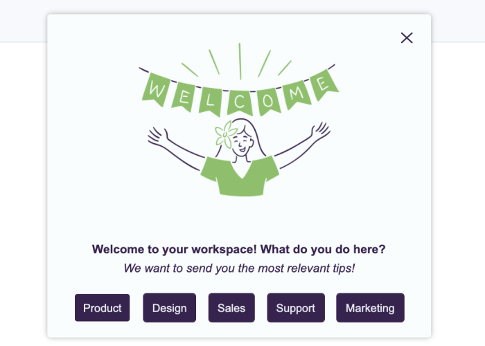
Here’s an example of an attractive and welcoming onboarding tour.
Offer tooltips at key points #
Once you’ve identified where users are encountering issues—be that with rage clicks, cursor thrashing, or any other display of frustration—you need to provide guidance. This will help you reduce abandonment rates and give a simpler experience to users.
For example, if users are repeatedly getting stuck when searching for something within your product, add a tooltip that provides guidance on what to do. That way, if they encounter issues and the solution is right in front of them there’s no need for frustration.
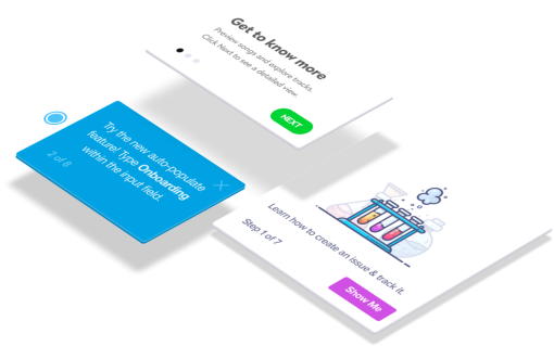
👉 Check out this interactive demo on creating Chameleon Tooltips that delight.
Include self-serve support #
Research shows that 88% of consumers expect businesses to have an online self-service support portal. Sure, some problems require more attention—but the vast majority of issues can often be resolved with an FAQ or self-service support solution.
Include in-product help menus in your in-app messaging strategy. This will deepen user engagement and feature discovery. Instead of leaving the page to find the FAQs or support service, let users tap a widget and type a question to find guidance.
This is how we did it at Chameleon to offer an easily accessible list of useful resources within a Launcher—a customizable in-product widget.
Run in-product surveys for instant feedback #
You always want to be learning from your users, whether that’s what they love or what they can’t stand. The best way to do this is to ask them.
Getting customer feedback doesn’t need to be treacherous or long-winded. That’s a thing of the past. Instead, create contextual, targeted in-product surveys to build continuous feedback loops from your product users.
Once you’ve implemented the changes based on the feedback insights,, you can then look back and benchmark it against previous data. This helps you identify the UX/UI patterns that are most effective with your users, and continue building a more intuitive design.
Wrapping up: Lessons from bad UX examples #
That concludes our walkthrough of the bad UX/UI design examples, so now you know the mistakes you don’t want to make.
User experience is unique for each user, and a deeper understanding of user psychology is sure to help create comprehensive UX design patterns. Make sure you’re personalizing the experience to create a bespoke UX for all your users.
Lastly, prioritize simplicity and clarity in your UX. Dig deeper into your user personas to understand exactly what people want and need from your product, and how you can deliver and communicate it effectively.
Build in-app guides to retain users
Chameleon makes it easy for product teams to create product tours, tooltips, onboarding checklists, and in-app surveys without code.


