


🎁 Get your Chameleon Figma Components file
Rally your design team to achieve an on-brand look every time you create an Experience! Get your Figma file and apply your brand colors and fonts to all Experience components. This is especially useful as you get started, to ensure your branded look is perfectly translated into Chameleon. But also helps you incorporate more in-app design in your usual processes 😉
Chameleon Figma Components file
👉 Learn more about our Figma integration and get your file today!
✨ Canvas Borders
To achieve a branded style easier you can now add and adjust the "Canvas" borders from the Builder on any Experience you create. Enjoy deeper control for the ultimate built-in look!
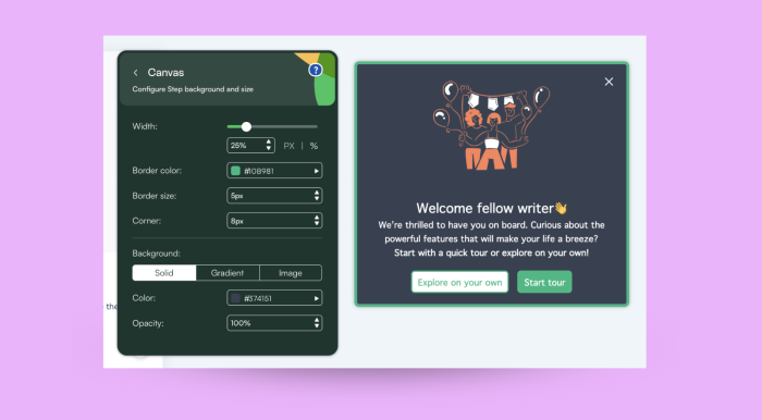
Canvas options in the Builder
👉 Explore the different styling options you have in Chameleon.
⚙️ We also improved our Debugger with clearer messages around "Triggers" and a better indication of Variants, in the case of A/B Testing.